

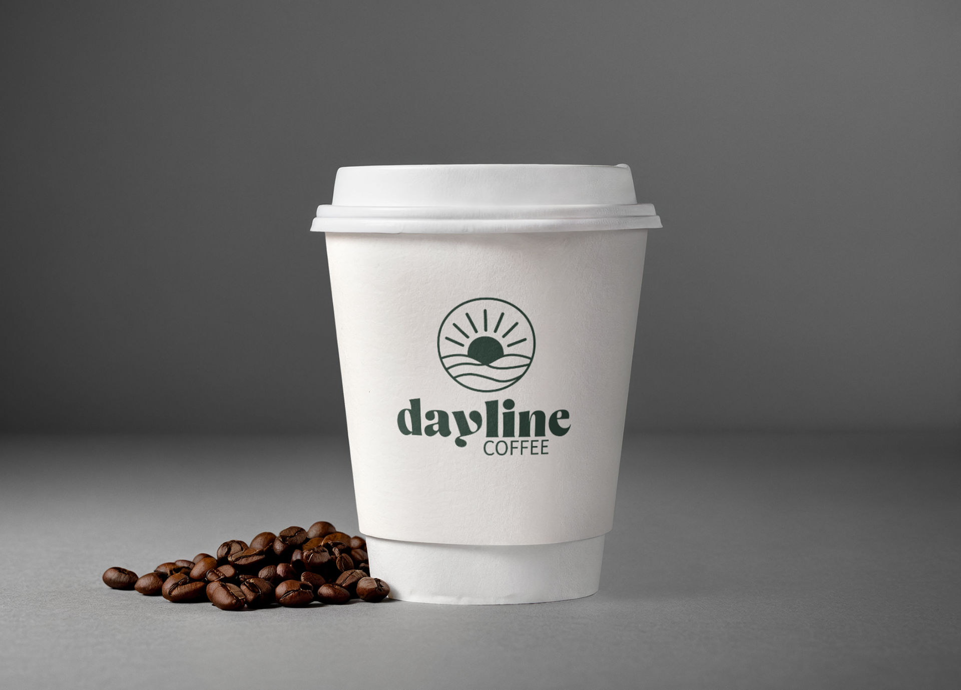
Dayline Coffee, the name itself is about rhythm and energy. A dayline represents the line where day meets night, that moment of balance, calm, and renewal. I wanted to capture that feeling in a brand that celebrates good coffee and good days.
The stand is designed for millennials, and Gen Z people who care about what they consume and how it’s presented. In New Zealand, there’s a strong focus on health and mindfulness, so I wanted the cart to feel fresh, earthy, and grounded. The colours are inspired by nature, greens, warm woods, and soft neutrals, creating a space that feels both energising and peaceful.
Dayline Coffee isn’t just a place to grab a drink; it’s a moment to pause. The design reflects that, clean lines, natural textures, and a welcoming atmosphere that invites people to slow down and enjoy the ritual of coffee. It’s about creating a healthy-looking stand that feels approachable, modern, and connected to the environment.
Mockup 1
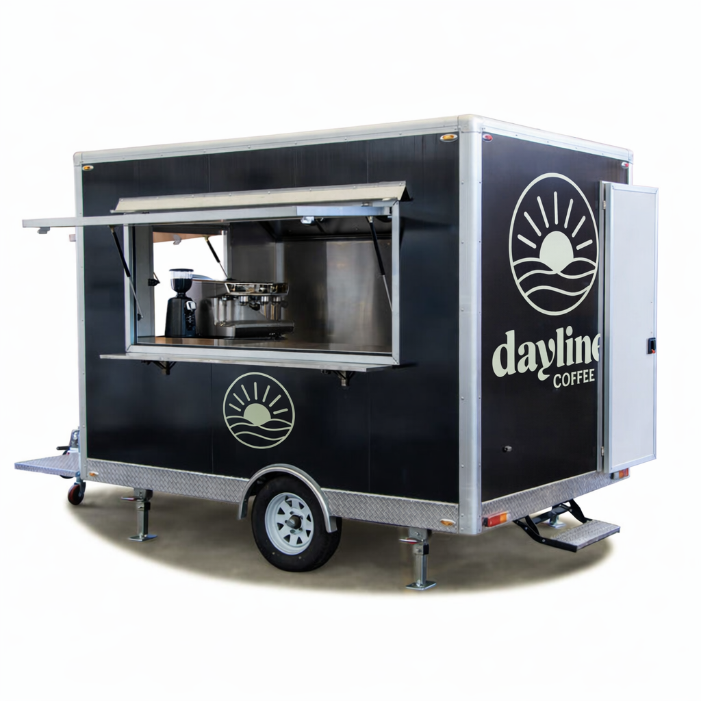
The original black cart had a sleek, modern look, and while I loved the structure, the dark exterior didn’t reflect the warm, earthy tones I envisioned for the brand. It felt too sharp for the relaxed, nature‑inspired atmosphere I wanted to create.
Mockup 2
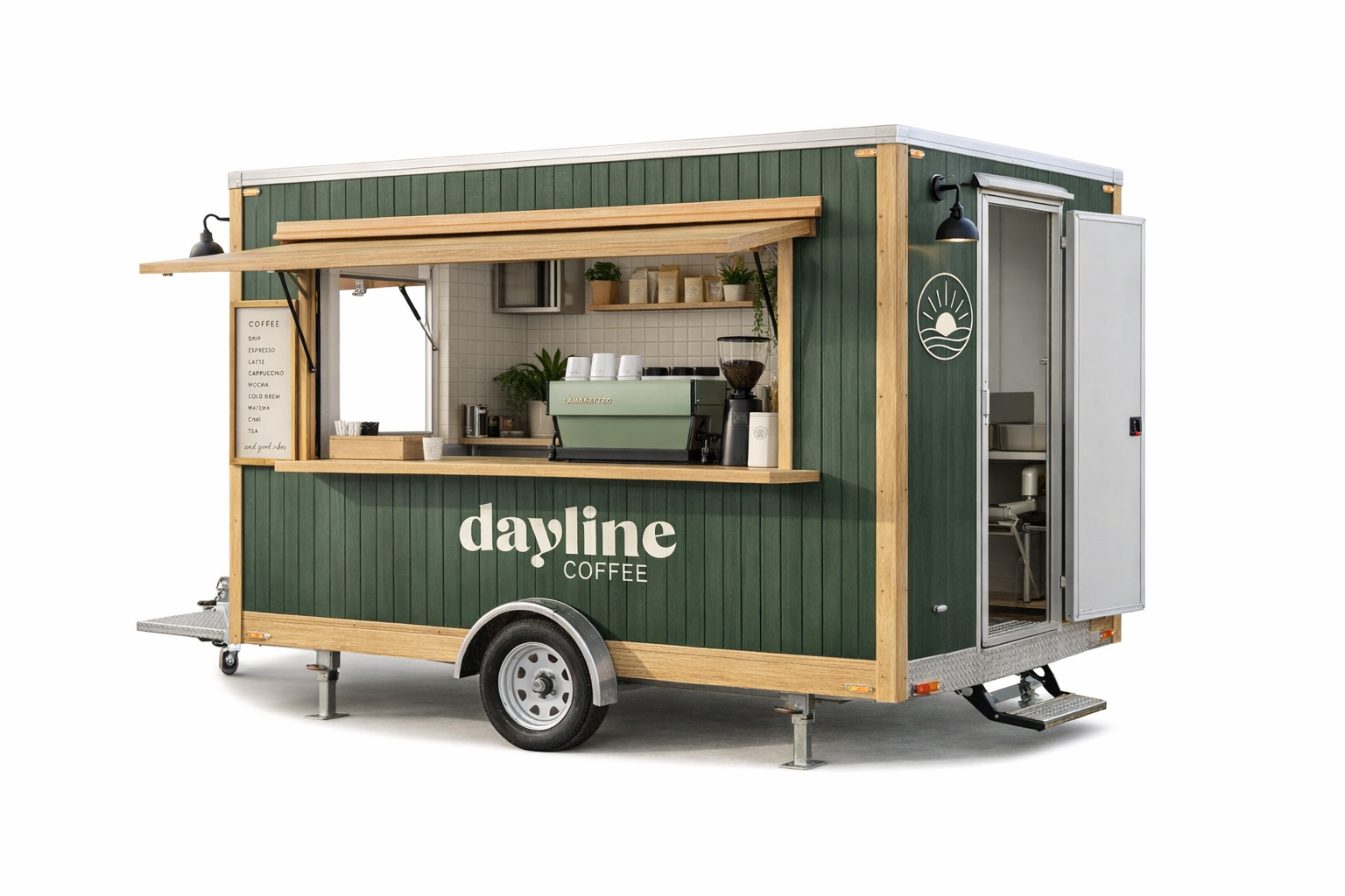
I’m really drawn to the exterior of this cart. The combination of warm wood textures and earthy greens creates an inviting atmosphere that instantly feels approachable. It has that relaxed, wholesome energy that resonates so well with New Zealand’s health conscious culture.