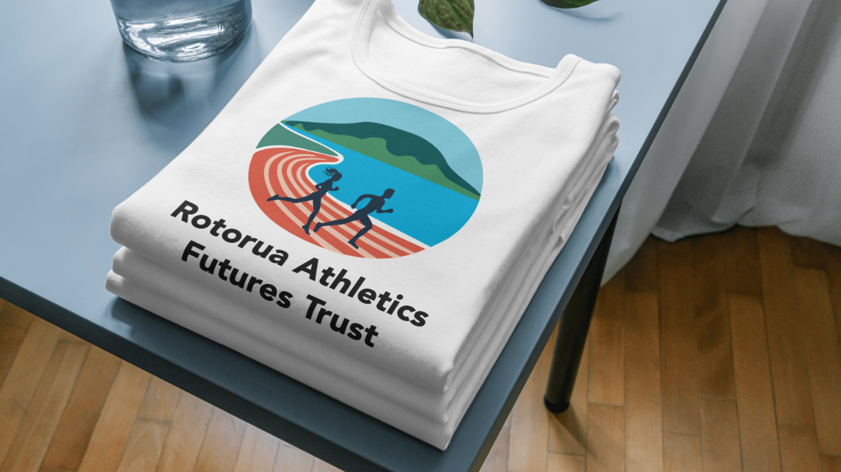
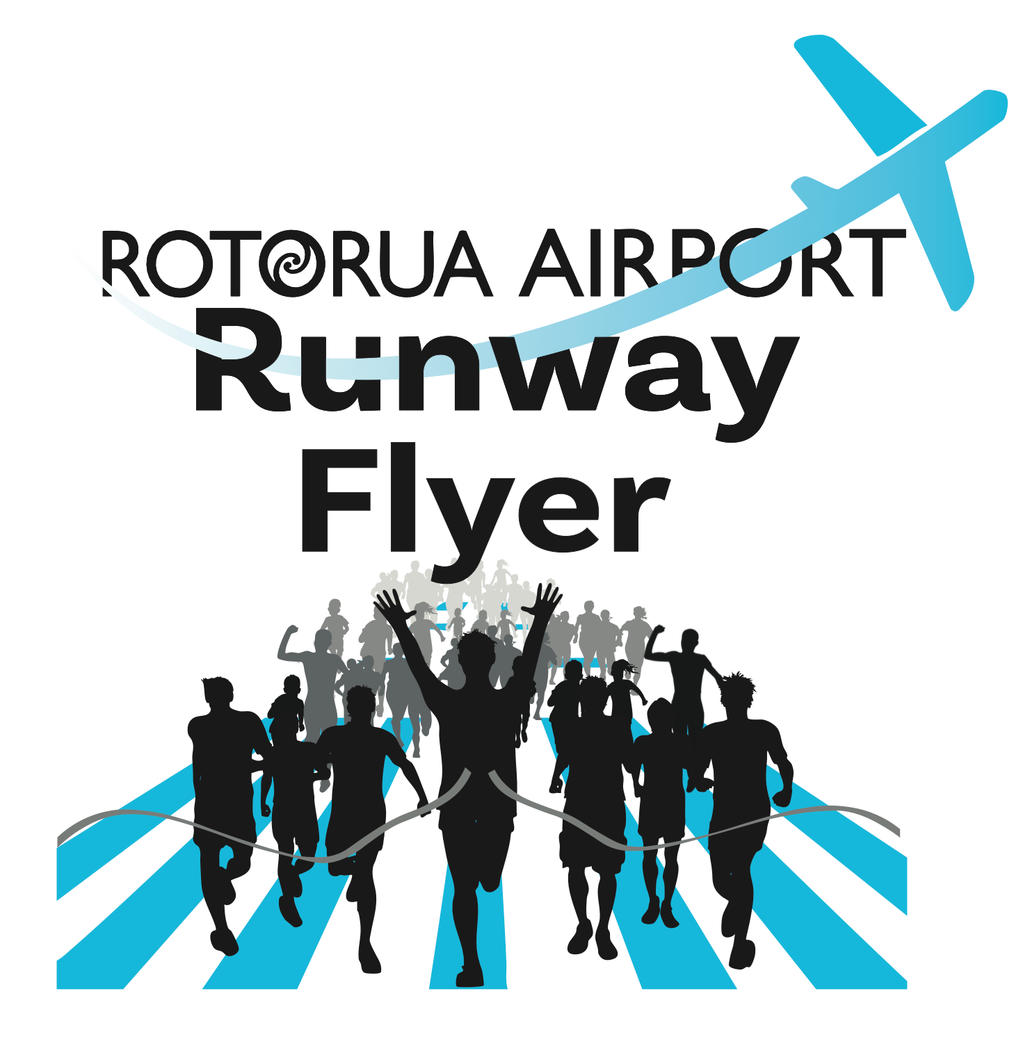
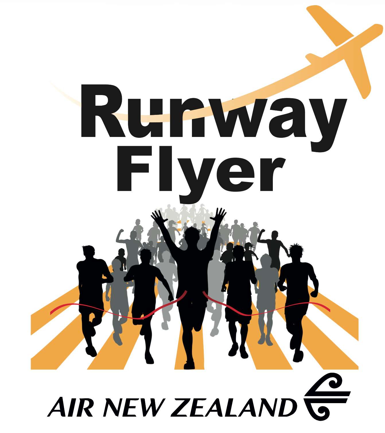
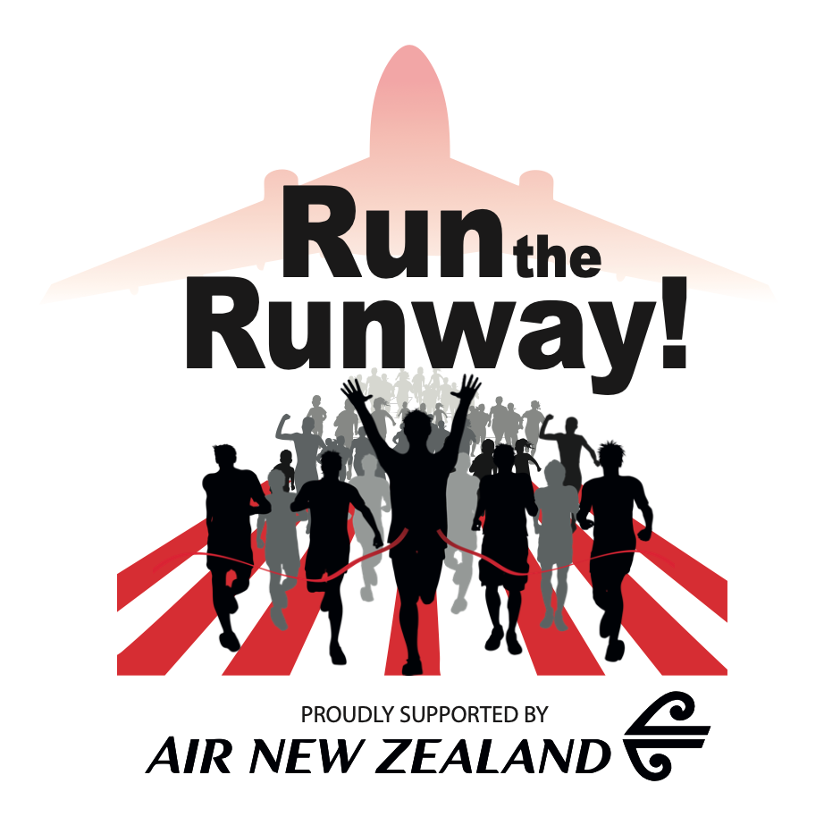
The two concepts above show the early colour and layout explorations for the event identity. The yellow concept was initially suggested, but the runway markings appeared too similar to French fries rather than lane lines, so it was quickly ruled out. The red version had strong visual impact, but the client felt it was too intense and jarring for a community event.
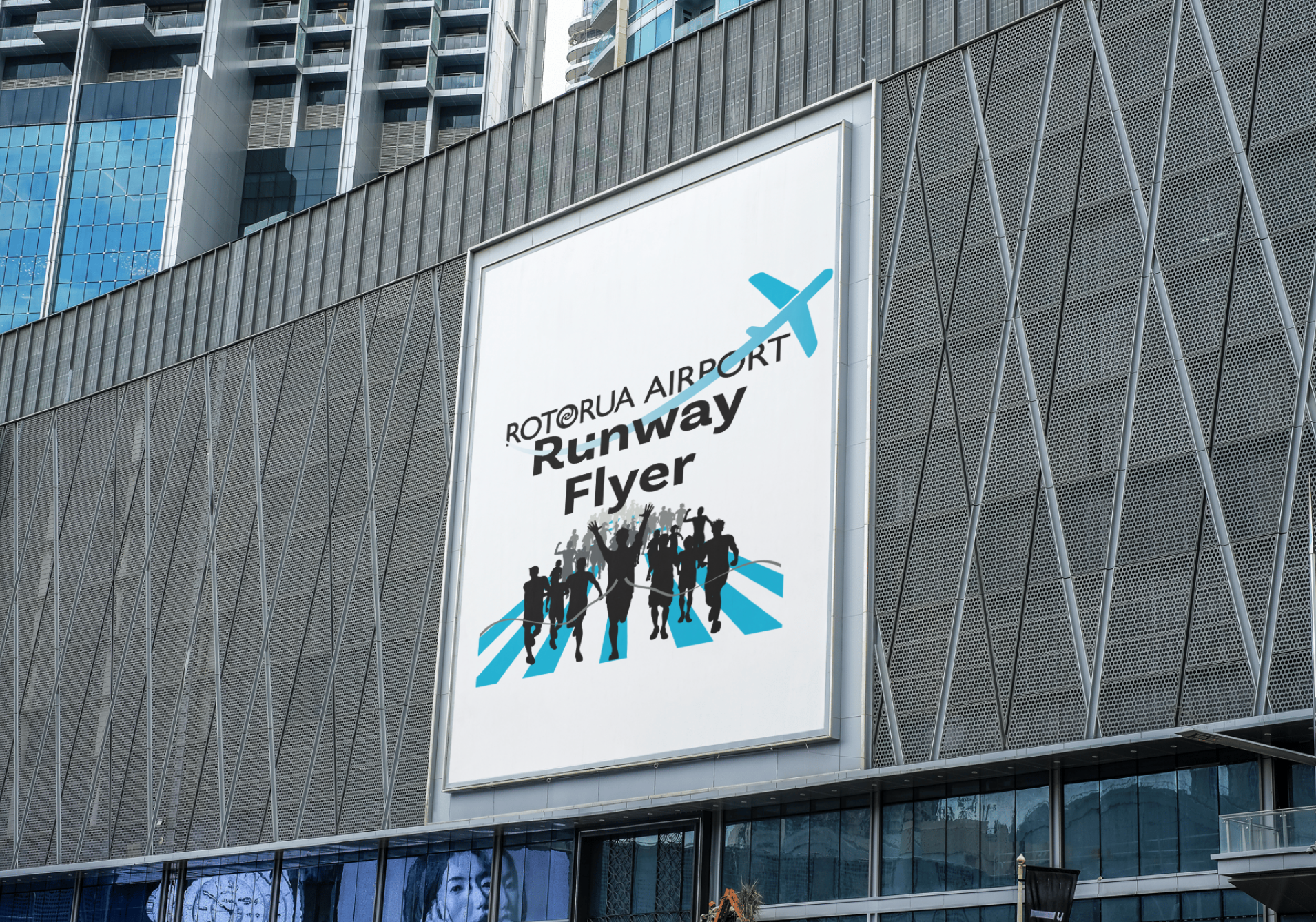
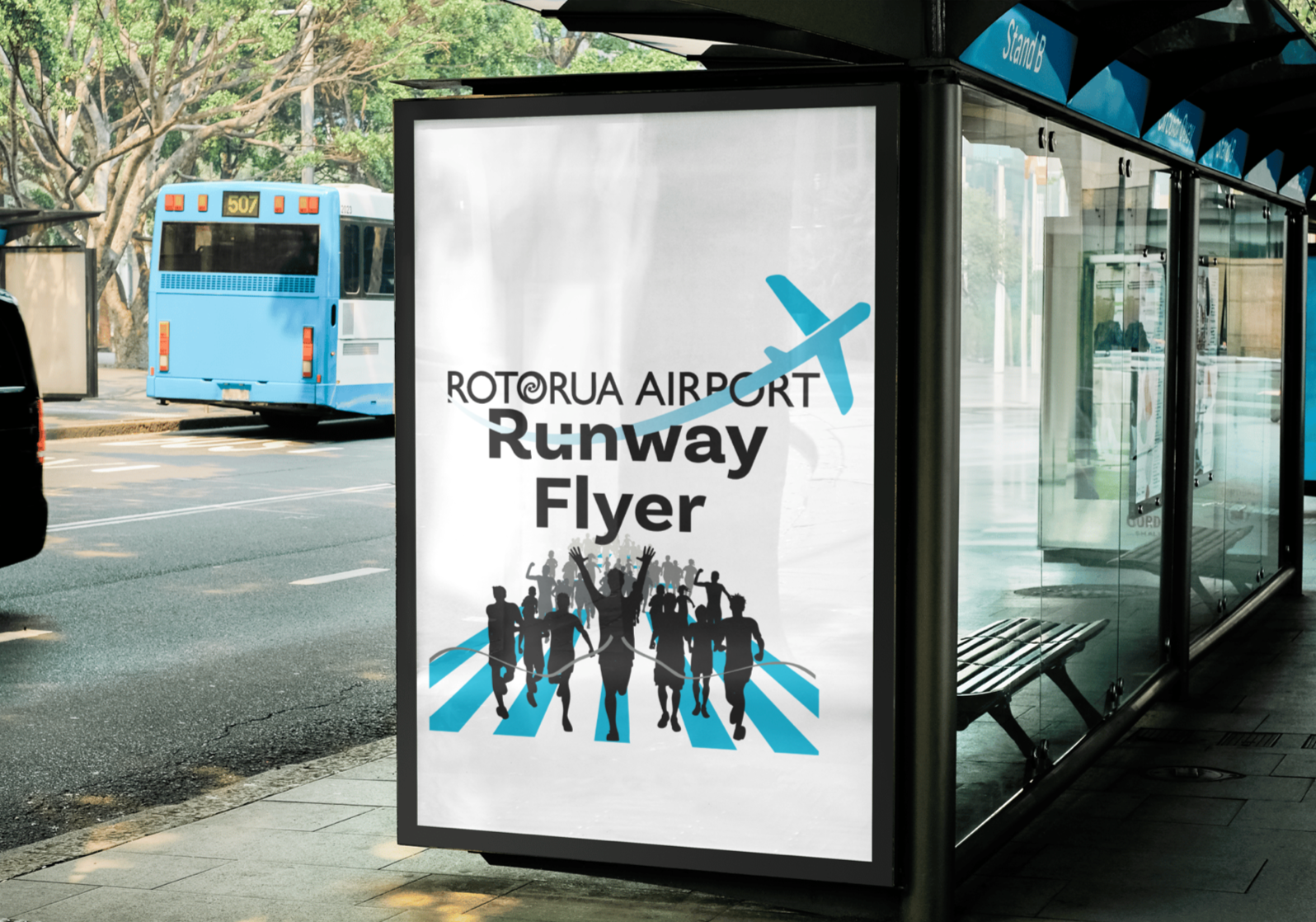
Red is bold and attention grabbing but can feel aggressive. Yellow is energetic and youthful, yet can become overwhelming when used in large areas. Blue, however, offered a balance of strength and calmness. It is bold enough to stand out while remaining easy on the eyes, making it more suitable for an event aimed at a wide age range. For these reasons, blue became the preferred choice moving forward.